Brand Essence
Our brand essence is both a summary of the core values of the Gyeonggi Arts Center and an important element in establishing and maintaining a differentiated brand identity. Based on this brand essence, we deliver consistent designs and experiences to our customers.

- Core Value
- 감동의 무대 : Moving Performance
- 열린 문화공간 : Open Cultural Span>
- 장르의 다양성 : Genre Diversity
- 창작 레퍼토리 : Creative Repertory
- Brand Concept
- 문화예술의 중심 : The Center of Art Culture
Design Concept
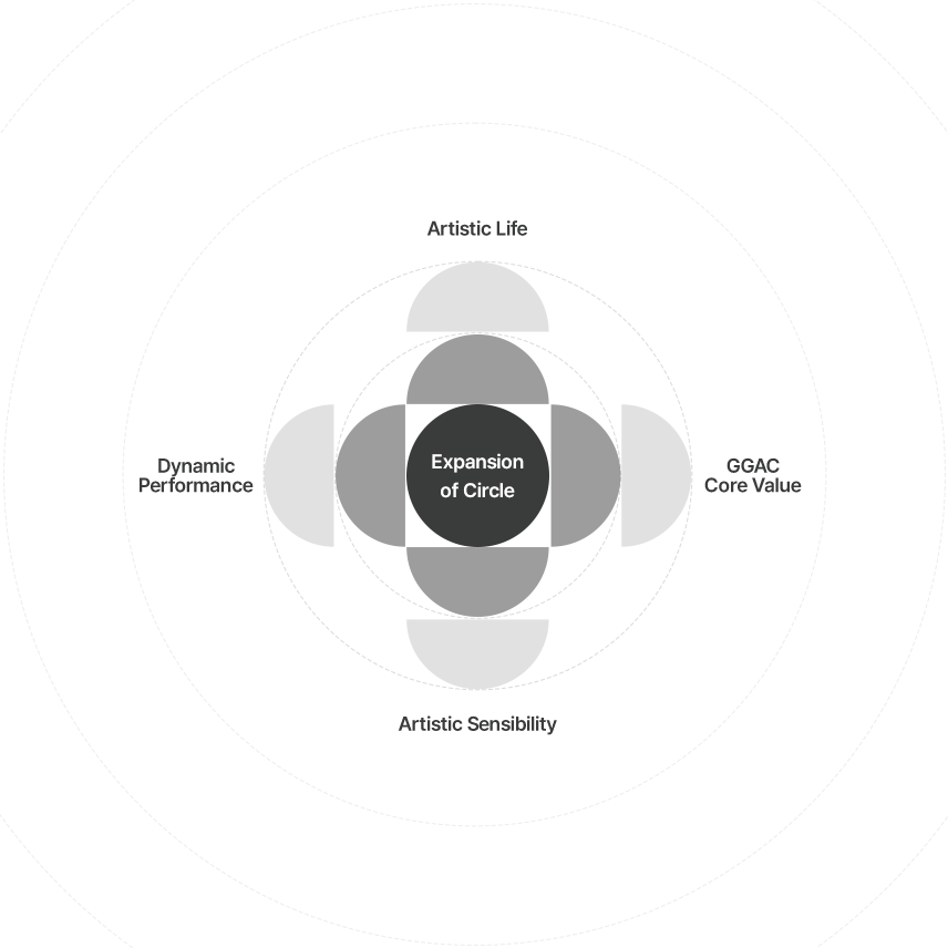
The new brand design concept
of the Gyeonggi Arts Center
is “expanding the circle.”
“Our circle” is the center of cultural art in Gyeonggi-do and symbolizes the values upheld by the Gyeonggi Arts Center.
Based on our core values, we seek to continue expanding outward, embracing the changing colors of society, and to communicate with our guests, as we increasingly become an integral part of their everyday lives.
The movement of the circle also represents the dynamic performances unfolding on the stage, while simultaneously symbolizing the powerful impression the stage leaves in the minds of the audience.

Our brand color, dark gray, is a color that holds infinite possibilities.
Dark gray is a color that contains all the other colors of the rainbow, in the same way that the Gyeonggi Art Center contains the diverse values of a wide range of professional organizations and their performances.
Dark gray is a calming color that symbolizes harmony and balance.
It represents the balanced quality and seriousness of arts performances at the Gyeonggi Arts Center.
Primary Logo

represents the Center’s role as a hub of culture and arts, communicating with audiences and expanding into their everyday lives.
The circular typography symbolizes the values embodied by the Center —
a stage of inspiration, an open cultural space, artistic diversity, and creative repertories.
The repetition of semi-circles and the variation in colors emphasize the concept of expansion.
Sub Brand

BROWN
This color symbolizes the identity of the Gyeonggido Theatre Company, which always questions its neighbors and society, but never forgets to be friendly and kind.

YINMN BLUE
This bright shade of blue represents the identity of Korean music and the new formation of the Gyeonggi Sinawi Orchestra.

RED
This color symbolizes the dynamic movements of the Gyeonggido Dance Company, with its high level of sophistication, its passion for dance, and its dedication to the audience.

BLUE GRAY
This color symbolizes the identity and originality of the Gyeonggi Philharmonic Orchestra, which combines a modern sensibility with authentic classical music.

GREEN
Green symbolizes the friendly musical world of the Gyeonggi Pops Ensemble and its affinity for popular culture.

PURPLE
It symbolizes the value of inclusiveness, embracing diverse personalities and creating harmonious unity.